v0.0.2: Open Source GitLab repo review (/wireshark/wireshark)
My first GitLab repo review, this will be fun, let's dive in...
I usually review GitHub repos, but I thought it was time to review a GitLab repo. Thank you to Michael Friedrich for submitting the Wireshark repo for review.
Here is a short description of this project from their website:
Wireshark is a network traffic analyzer, or "sniffer", for Linux, macOS, *BSD and other Unix and Unix-like operating systems and for Windows. It uses Qt, a graphical user interface library, and libpcap and npcap as packet capture and filtering libraries.
First impressions
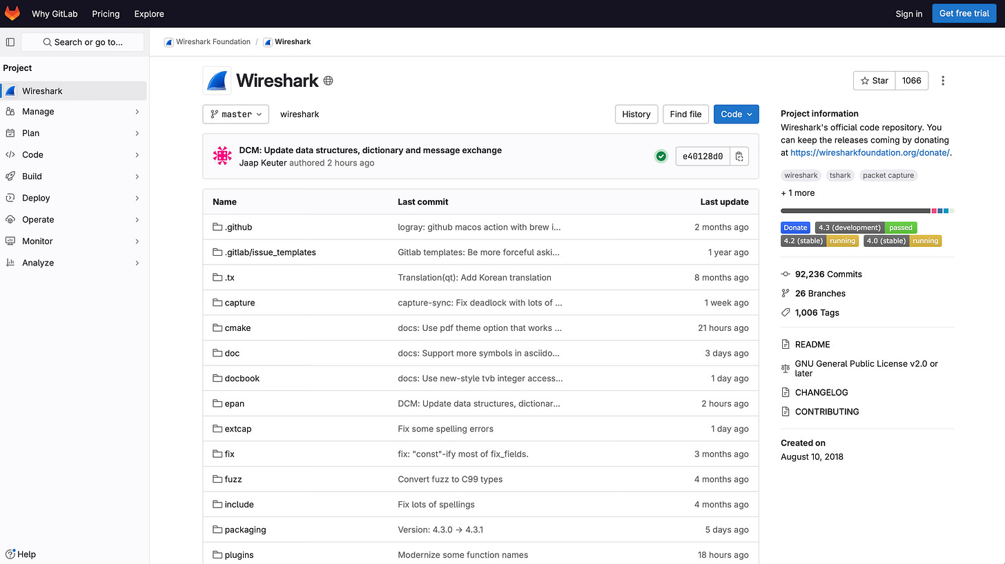
My eyes are first drawn to these 4 pieces of information:
1k+ Star: this not an important metric, but for some reason this is something that naturally most people always look out for.
Almost 100k of git commits: seems like a very active and long standing project.
Uses the “master” branch not “main”: the project has probably been around for a while and has not changed the default branch.
Badges: I am used to seeing these in the README, so to see them hoisted up I think is great as I don’t need to scroll down to see the Badges that the project wants to highlight.
My next step is to scroll down to the README; maybe I can get a screenshot of the software? Unfortunately, there isn’t one. My suggestion here would be to add a screenshot, even if there is a risk that this would get out of date (although I feel this is unlikely on such a mature project). The benefit of having a screenshot is that it will attract more people to look into the project further.
What I really like is that I don’t see any unused features displayed on the repo landing page. I am not sure if GitLab hides these automatically if not used, but this gives the repo a very “clean” look as it only shows me sections with populated information.
Issues
There are many Issues, but most do not have Labels. I know this takes a lot of time for the maintainers, but it definitely would help the project and contributors filter through Issues.
The Issues on the Issue Board seem to have Labels, so I am not sure if they only get Labels once added to the board? To do it in this way might be the project strategy, however I didn’t see anything about it in their Contributing Guide - maybe it is an unspoken rule?
Wiki
Wireshark seems to make extensive use of the Wiki which is great! Their docs seem to be well organised and fully featured.
I really like that in their Wiki they even have a page on “Presentations” which is really awesome to see. I think other projects need to adopt this idea so that people can easily find talks given about the project and different perspectives. Plus the speakers can get some visibilty also - I see this as a two way street.
Empty sections
There are two sections in “Plan” on the left: “Iterations” and “Requirements” that are empty. Personally I would like to see these hidden so that I am not distracted by unused sections. What do you think?
Merge Requests (MRs)
This looks very active, with recent MRs open and also multiple comments on each - great to see the collaboration in the community.
This is the section where you can check the latest conversations and collaborations, to see if it is a project you would like to get involved in.
Build (CI)
I love this section, it is the heart of any project, where all the automation magic happens. Tasks like linters, automated tests, releases and then finally deployment. Seeing the various repo events trigger jobs and pipelines for the project, and the badges changing state. For me this section brings the project to life.
From the screenshot you can see the different state of the Badges and their colours: skipped, running, passed - and there are more. Is it only me who enjoys to watch these change state? Maybe because I always hope there are no red badges…
Releases / Tags
Git Tags are being used in this project. I personally prefer to see Releases being used, as this can present additional information about the Release/Tag. They are basically the same (so there are no disadvantages), but I feel the Developer Experience (DX) is better with Releases.
Environments
Another empty section, so my suggestion here would be to hide it if possible.
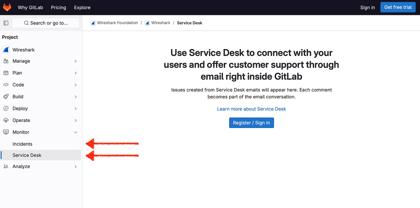
Incidents / Service Desk
Currently this doesn’t seem to be used on this project, but OH MY, this is the first time I am seeing these features and I love this idea! The Service Desk connects the users with the maintainers, and one of the reasons I think this is great is because the users (potentially customers) may not have GitLab accounts, but are still able to give feedback via email. Plus it all still appears in a single place for the maintainers. Information is kept transparent and doesn’t interfere with the Issue section.
With Service Desk, your customers can email you bug reports, feature requests, or general feedback. Service Desk provides a unique email address, so they don’t need their own GitLab accounts.
This is something I need to look further into for my next SaaS product, more on that later, subscribe for free to my publication not to miss out…
Conclusion
The Wireshark project is super active and well organised. My constructive feedback would be:
Use Releases
Hide the following sections as they are not used (if possible):
Iterations
Requirements
Environments
I hope you enjoyed my first review of a GitLab project, it was super fun and interesting for me to see how other projects manage their repo, but also how it compares to GitHub (which I have so far used much more).
The way in which GitLab have set up a repo is super interesting and something I am looking forward to delving into more in the coming months. If you are curious about GitLab let me know what areas you would like me to explore.
If you prefer to watch a video on this review here it is:


